Case study
Collette Vacations
Two and a half years, one design system, and the layer it never had.
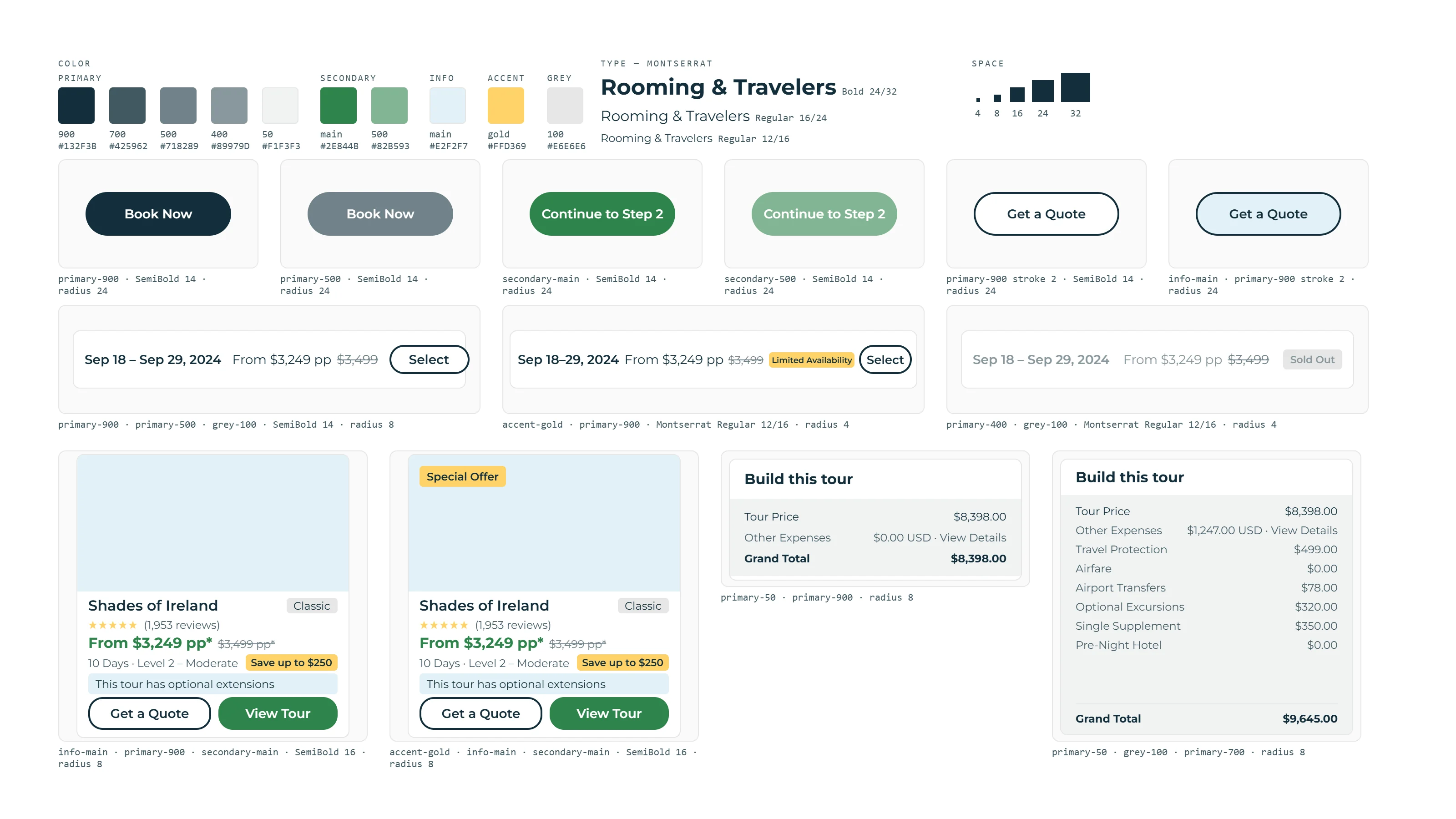
I spent two and a half years as a UX/UI designer at Collette Vacations, a guided-tour operator selling mostly to travelers over 55, on a design team of two to three. I arrived just after an agency rebrand, as a full site redesign was being built from high-fidelity Adobe XD prototypes — the entire site, produced in about two weeks, a few months before I was hired. There had been no time for a system, so there wasn't one on the design side: no shared components, no spacing or type scale, no design tokens. The site launched that way, and much of the following year went to fixing it after the fact.
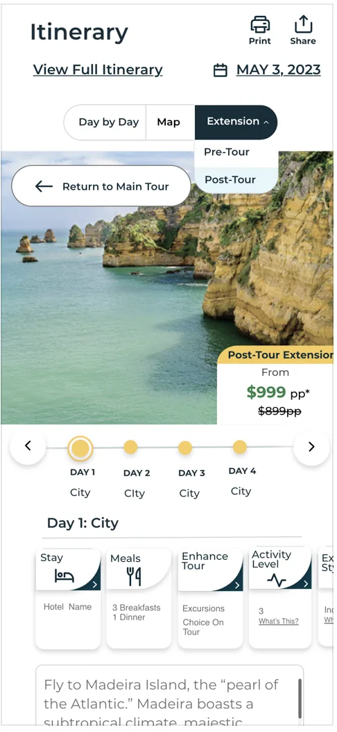
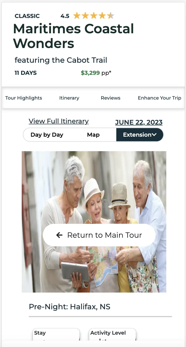
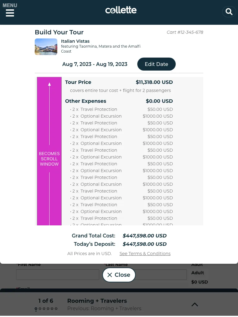
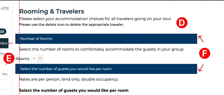
Over the next two years we built the system that launch never had. The palette and typefaces were set — the brand design consultant had delivered the colors as a numbered ramp, and the site's Material UI theme carried those numbers into code — and everything else was ours: the spacing scale, type sizes, buttons, and a component library. It also had to hold under three partner loyalty programs whose members redeem rewards for a Collette trip: their logo and colors, not ours, and in one case a points-plus-cash price model. Handoff was the hard part. Before Dev Mode it meant hand-made diagrams over Zeplin exports — spacing, scroll windows, max heights — for six to eight developers, then design QA alongside the QA team after every round of development, because the build often didn't match the file. We moved the workflow onto Figma, and in 2024 ran Collette's first Dev Mode rollout: developers inspecting the live file instead of a diagram of it.
Research was ours too. Across the two and a half years we ran more than 200 UserTesting.com sessions, moderated and unmoderated, screened to the same 55+ buyer. Comparisons were balanced — half the participants saw one site first, half the other — so order couldn't skew the result. In my last four months I ran nine competitive studies, ten participants each, one page apiece against Trafalgar, EF Go Ahead, Tauck and others, and presented a findings deck for every one. The pages below draw on them.
Compare Tours shipped: stakeholders wanted a way to weigh tours side by side, and it went from research to production in 2023. Reviews was approved, then never built: a leadership change reset priorities before development started. The flight-booking redesign didn't ship either — the final year's work was overhauled before it reached production.
NEO — Internal tool for the loyalty department: thirteen dashboards, a separate stakeholder group and IT team, its own standups. Approved and shipped.
Wyng quiz — Built with the customer-experience team to collect feedback from site visitors. Approved and shipped.
Testimonials — A component family for the site's testimonial slots — text, small video, large video — in seven layout combinations, built into the Figma library. The video variants never went live.
The gaps between what we specced and what got built trace to one thing. Both sides had primitives — the consultant's numbered ramp, greys, accents — and the code had Material UI's generic roles: text, background, action. What neither side had was the layer between them: component tokens a designer could spec and a developer could reference, under one name. So the QA list says "match the Primary Blue #132F3B" while the code calls that value primary-900, and the section header was built from neither. Ninety items on that list; two absolute values. Each page below ends with what that layer would have prevented.
| Value | What the spec called it | What the code called it | Component token |
|---|---|---|---|
#132F3B
|
Primary Blue |
|
none |
#2E844B
|
CTA green |
|
none |
#E2F2F7
|
light blue |
|
none |
#FFD369
|
gold |
|
none |
#718289
|
primary hover |
|
none |
Three deeper pages are in progress.
Air booking
In a 2023 usability test, 2 of 10 participants got any flight results at all. What I changed, and why it had to hold under three partner brands.
Reviews
The site redesign dropped four things the old reviews section did. A regression recovery, not a redesign, and where the one-star review belongs.
Compare Tours
The one that shipped: the desktop/mobile restructure and the scroll-and-accordion logic.